Archive for the Comparisons Category

Wolfe at the Door…

Posted in Close Up, Comparisons, Gene Wolfe, New Arrivals with tags , , on July 21, 2011 by Aaron

GENE WOLFE
The Sorcerer’s House, 2010
Home Fires, 2011

It arrived today.  Another very attractive addition to my signed Gene Wolfe first edition collection.  I’m now feeling like I’m wanting to pick up the first tome in this series, 2009’s The Very Best of Gene Wolfe.  These are getting pricey… I dunno…. but they are SO beautifully presented as I mentioned in the look we had at The Sorcerer’s House. I might succumb.

Well, lets have a look at them.  These aren’t super-detailed examinations like the regular Close Ups, just a quick look.  First is The Sorcerer’s House.  Click on the pics for a bigger view.

Beautifully tray-cased, and you can see the signature page there signed by Gene Wolfe and the author of the introduction, Tim Powers.

If we crack it open and have a look we can see how nicely its presented.  Unfortunately, you can see some nasty reflections there on the lower left of the jacket.  This is because of the jacket protector I put on it a while ago.

Having a look at my copy of Home Fires, note the identical presentation, though the signature page containing Mr Wolfe’s and Alastair Reynolds’ scribbles isn’t of the same high quality as that of Sorcerer’s.  Incidentally, I’m on an Alastair Reynolds fix at present having listened to Chasm City, The Prefect, Revelation Space and Redemption Ark over the past couple of months, and currently on Absolution Gap.

Although I mentioned consistency before, they aren’t consistent in one respect. The ribbon used to draw the book from the case is anchored on the left here, yet fixed to the right in the previous book’s case.  Check it out.

No reflections here – the jacket protector went on subsequent to this photo session. Back to the consistency thing, in the case of Sorcerer’s (pun intended..), drawing on the ribbon raises the spine end to be grasped whereas in this case (again, pun intended..), the open edge is elevated to facilitate withdrawal.

I’m very happy small independent publishers like PS Publishing can give us attractive editions such as these.  They are gorgeous editions from my favorite author and grand additions to my library.

I can now put my finger on it…

Posted in Comparisons, Review with tags , , , on September 25, 2009 by Aaron

Something was bugging me while reading Cosmic Engineers.  I couldn’t work out what it really was, but during the course of reading it and then doing the Review I felt there was something missing in the book.  Something lacking that I didn’t have the experience to identify and bring to the light of day.

I’m reading The Mixed Men at present.  While reading (I’m about half-way through) it suddenly occurred to me what that something was.  It was something that was present in The Mixed Men and shone out so distinctly when I thought about Cosmic Engineers.  In a word: Character.  Or rather Characters.  Real ones.

Author of The Mixed Men, A.E. van Vogt dwells a lot in the minds of the principle characters.  We learn what they are thinking and why, a little of their history as people and what makes them tick.  This is totally absent in Cosmic Engineers.  With the possible exception of the revived female character whom we do learn a little about, the other characters are cardboard cut-outs.  No back story, we never learn what they are really thinking and as a result, I at least didn’t really care about them, or the story.  And this, I think,  was also part of the reason I was so critical of it.  I imagine if the characters involved were more substantial, if we got some more insight into their personalities and thoughts, then some of the more outlandish stuff may not have mattered so much.

Close Up II: Children of the Atom

Posted in 1953, Close Up, Comparisons with tags , , on July 13, 2009 by Aaron

closeupAs I mentioned in the original Close Up, I want to look closely at the two jackets I have for this book.  Both jackets are barely Good, but I’m not sure which is the better.  I’m just going to offer the two jackets up for closer analysis and any opinions would be most welcome.  Click the pics to see large size images.

The first jacket is the original – the one that came with the book.  We saw this in the first Close Up.
COTA01COTA01_inSomething I didn’t mention earlier is the existence of reinforcing tape on the inside.  Check it out.
Something else I didn’t mention was that cover artist Frank Kelly Freas’ name is misspelled on the rear flap – Frank Kelley Frease.  That’s something for the trivia section.

The second jacket was thrown in for me when I picked up ‘Travelers of Space’, ‘Five SF Novels’ and ‘Men Against the Stars’.  Thanks Matt.  Anyway, I’m not sure which is the superior, they both have similar defects, but I suspect the second jacket might be slightly better because there aren’t any holes, the edges are generally better and there’s no tape.  However, there is some slight discoloration on the second, most noticeable on the spine, and the jacket isn’t quite as bright.  Have a look.
COTA02What do you think?

Close Up II: Men Against the Stars

Posted in 1950, Adventures in Science Fiction Series, Close Up, Comparisons with tags , on June 4, 2009 by Aaron

closeupMartin Greenberg, editor
1950

A little bit against my better judgment, I bought another copy of Men Against the Stars.  The attractions were price, condition and second state jacket.  The price was good – only $16, the condition of the book itself is NF and the jacket is VG (with a proviso), so I have both states of the jacket now.  I’ll compare the two books briefly here.  Click the pics to step through to larger images.
MATS01The newer copy is on the left.  You can see it’s a bit brighter and has much less wear.  That strange cracky/flaky wear I mentioned in the initial Close Up is evident on this jacket too, but to a much lesser extent.  I’ve been thinking about that and I suspect it might be a result of such a black-ink-loaded jacket.
With the jacket off, we can really see a difference.
MATS02Apologies for the inconsistency, but the newer acquisition is on the right here now.  It’s very obvious that the spine is much cleaner and it’s a little difficult to tell, but the boards are a lot sharper and in like new condition.
The other major area of interest is the second state of the jacket.
MATS03You just need to check out the vintage of the titles promoted on the back to determine which is which here.  Interestingly, you can see Gnome Press relocated sometime between the printing of these jackets.  Note that unusual wear on the older jacket.
Just a couple of other areas of interest on the more recent copy, a quick peek inside reveals that the pages and, more particularly, the free endpapers and paste-downs are very clean.  No marking at all and only a little discoloration.
MATS05In the original Close Up I pointed out and commented on the spotting on the edges of the block.  There is absolutely none here.  Very nice.  The last thing I want to look at is the tape on the inside of the jacket.
MATS04Someone has applied reinforcing tape to the wrap- around on the spine.  This is invisible externally, but it does bug me that it’s there.  I hope that over time it’s not detrimental.  It could be special book tape.  I would like to remove it and if anyone has some advice on that it would be appreciated.
All in all, I think it was worth getting this copy.

Close Up: The Shrouded Planet & The Dawning Light

Posted in 1957, 1959, Close Up, Comparisons with tags , , , , , , on May 30, 2009 by Aaron

closeupRobert Randall (Robert Silverberg & Randall Garrett)
1957 & 1959

I’m doing something a little different for this Close Up. Since these two books are effectively one continuous story, we’ll examine them together.  Looking at the two together illustrates something immediately.  It illustrates one of the things I wish never happened.  One of the things I struggle to understand.  One of the things I find disappointing about Gnome Press.  This: Why did the cover art go from wonderful, colorful, imaginative and descriptive, to… crap??  I suspect there are several answers to this question, and I’ll attempt to address this issue in it’s own post sometime.  For the meantime, we can see what I’m talking about here.

On the left, nice art, attractive, makes me interested.  On the right… not.

I usually give you bigger pics to enjoy, but I’m trying to put them side-by-side on this occasion.  If you want to see in more detail, just click the image and it’ll open the appropriate page on  the Gnome Press Flickr site.

Both books are very similar in condition.  They look good from a distance, but up close not so much.  We’ll have a closer look at this later.  Let’s take the jackets off.

‘Planet’ is in a little better condition here.  ‘Light’ has a bit of spotting on the boards.  Looking at the top we can see the usual darkening of the block.

‘Planet’ is a bit ahead here too.  It’s difficult to tell from these pics, but time has been a little kinder to ‘Planet’s’ text block.

You can also see that ‘Light’ isn’t quite sitting flat.  This is because I photographed it just after putting a dust jacket cover on.  I took the pics of ‘Planet’ prior to doing so.  The spine is a little more secure on ‘Planet’, you can see a slight lean there on ‘Light’ though that is exaggerated by the Brodart cover.

The difference in the darkening on the block is a bit more evident here.  The jacket on ‘Planet’ is a little worn on all extremities.

Though the jacket on ‘Planet’ is a little worn, ‘Light is in pretty good condition around the edges.  However, if you look closely at ‘Planet’ you can see an issue that both jackets share and is also quite serious on both.  Foxing.  Let’s have a closer look at portions of the jacket now.

You can see it prominently now, especially if you check out the larger pics.  I didn’t take a pic of the inner side of the jackets, but it is worse there.  Very noticeable on the endpapers too.

‘Planet’ is obviously suffering less in this regard and ‘Light’ does have issues as you can see.  Check out a previous owner’s embossed stamping there on ‘Planet’, which also has another owner’s stamp on the front paste-down.

You also get a good view of the extent of the foxing on the dust jacket.  It’s evident all over, but this is about the worst spot on the book.

I mentioned both books have the typical Gnome block browning and ‘Light’ is the worst off.

Almost in the same league as the copy of The Survivors I have.  The back of each book is quite nice and rip/wear free, the foxing is the big turn-off.  If it wasn’t for this endemic problem on these two books, their grade would be VG to NF.

Alas, this issue relegated both of these copies down to G I think.  It’s a shame, as otherwise they are both in great condition.

The Shrouded Planet
Year: 1957
Paid: $23
Art: Wallace Wood
Quantity: 5000 copies (2038 remaindered)
Binding: Navy blue boards with sky blue lettering on spine.
GP Edition Notes: 1st edition so stated.
Comments: Text block darkening and foxing on an otherwise nice copy.  Two previous owners stamps.
Expand Upon: wikipedia.com, Internet Speculative Fiction Database

The Dawning Light
Year: 1959
Paid: $29
Art: W.I. Van der Poel
Quantity: 5000 copies (1530 remaindered)
Binding: Navy boards with red spine lettering.
GP Edition Notes: 1st edition so stated.
Comments: Significant block darkening and foxing on an otherwise nice copy.
Expand Upon: wikipedia.com, Internet Speculative Fiction Database

These two books to my mind are in exactly the same condition.

condition

Comparisons

Posted in Comparisons with tags , , on April 2, 2009 by Aaron

Christophe, my Gnome collecting friend from France send us pic of the French edition of Sixth Column.  I’ll let him fill us in:

…a pic of the French edition for Sixth Column (a softcover with dj). It’s interesting because it was published in 1951 which makes it one of the first SF books published in France.  It was released in a detective fiction collection and was – as far as I know- the first attempt for a mainstream publisher to publish a series of SF books. They also released Death’s Deputy by Hubbard and…stopped there.

Good stuff, we can compare the two covers below.

frenchsixth

You can see a couple of flat-faced monkeys getting the death-ray treatment there from a Priest of Mota.  Sterling use of the Ledbetter Effect.  Check out the Review if you aren’t sure what I’m talking about.

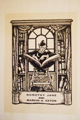
In addition, I mentioned a few days ago about him having a book with the same book plate as I have in one of mine.  He sent me a pic of that as well.

bookplate

Mine is on the left, out of my copy of The Survivors by Tom Godwin.  Christophe’s comes out of Robert Randall’s The Dawning Light.  I know, I know… for all you know I could be pulling a fast one and they both could be out of the same book.  Well, I can assure you they aren’t.    It’s a small world in Gnome Press collecting circles.

Confirmation

Posted in Comparisons with tags , , on March 30, 2009 by Aaron

I’ve recently been in contact with a fellow Gnome Press collector – Christophe Burg.  It’s been great to share thoughts with a like mind.  Christophe has a signed copy of Travelers of Space and kindly sent me an image of the signature in that book for comparison with the signature I have in my copy of Journey to Infinity.  Comparison below.

They certainly look the same to me.  I raised the question in the Close Up of ‘Journey’ and it’s great to have someone out there come up with an answer.  I have some additional tidbits of information from him, and these will come up in the future once I get around to the books concerned.  Many thanks Christophe, much appreciated and stay in touch.